Thank you for being a subscriber of SnapFix: the official newsletter of Mosaic Moments®
MOSAIC MOMENTS® PRESENTS:
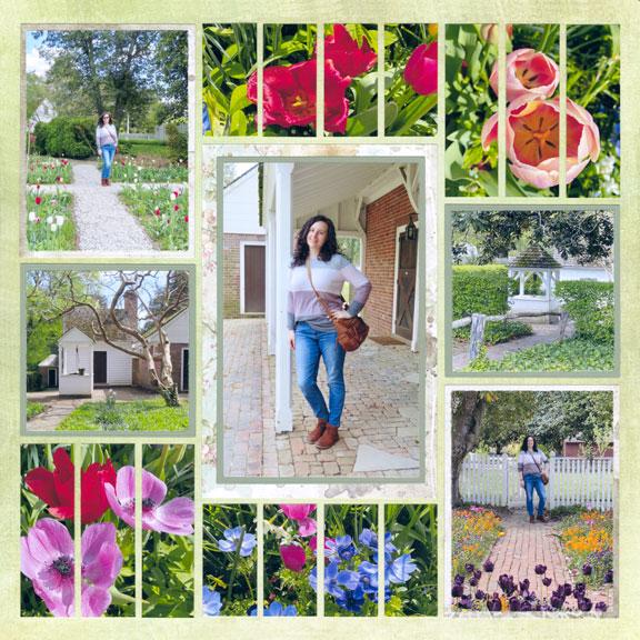
"Walk Through the Gardens" by Paije Potter - Pattern #582
Hello
Welcome to Wednesday's Snap Fix!
Do you ever struggle to find the right colors to make your photos pop?
I sure do! Sometimes, trying to pick my colors makes my whole scrapbooking process come to a screeching halt.
If you have ever felt this way, take a look above at Paije's layout. She chose Fields 12x12, a light distressed style grid paper - perfect with her photos taken at a historic site. It's also a lighter color than her photos which really makes the foliage stand out. She added to the old world feel by picking an ivory distressed patterned paper. Then to highlight her main
focal photo, and two side photos, she chose to mat them with a green that is slightly darker than the Fields Grid Paper to add contrast.
Color does not have to be complicated!
Keep your colors simple and don't let it ruin your scrapbooking time. Below are 5 links for more expert color advice and designer examples. Use these color ideas on your layouts!
Color choice is an important element in scrapbooking and working with photos.
I hope these articles help you with your layouts so that your scrapbooking will continue to be your stress relief - not a burden! Share your color choices on your layouts on our Facebook group. I love seeing what you have been working on!
Keep clicking on your Snap Fix every Wednesday for more helpful tips, insider tricks, and our designers' examples.