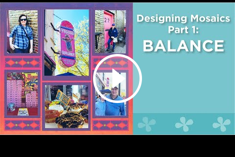
You asked how to create better pages; so, today we are sharing a series of articles focusing on basic design principles. Think of it as a crash course to graphic design. The first article is about balance. Balanced layouts are pleasing to the eye and help the viewer zoom in on the focal point.
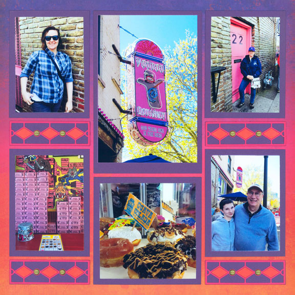
The above layout uses the same embellishments and colors on both sides of the layout to keep things balanced. However, Paije also created balance with the imaginary weight of her photos. You can learn more about balance, and see lots of examples, by clicking the blue box below, or watch our video. Scroll down to learn more!
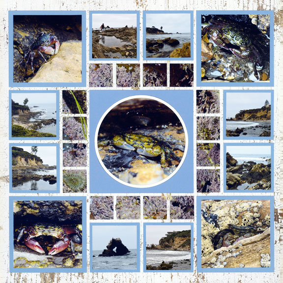
Did you know you can make your layouts sing? That same beat that gives us a pleasing rhythm in music, can also be present in art. Learn how to achieve your own rhythm with the article below.
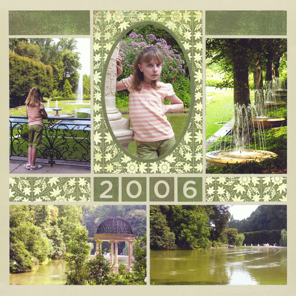
"Alexis at Longwood Gardens" by Tami Potter - Pattern #328
Just like your living room needs a focal point or feature wall, so do your layouts. In this case, Tami used the Oval Frame Set and patterned paper to create a focal point. Learn more ways to do this by clicking the blue box below.
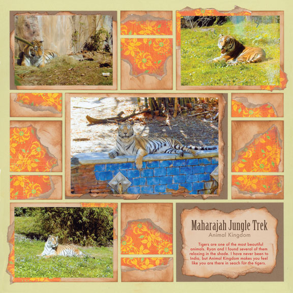
When elements of your layout are in harmony with one another, everything flows beautifully. Here, Paije used the same torn-paper effect to bring all of her elements together. See more examples of harmony and unity by clicking the blue box below.