A picture is worth 1,000 words, but sometimes, without the words, the picture has little value. If you have ever gone through great grandma's photos and found beautiful old photos, but you have no idea who the people are in them, you know what I mean. Or, maybe you took a vacation through multiple states. Without words, Utah and Arizona may be hard to tell apart and how do you know when those photos were
taken? It's easy to understand why we need words, but how do you add them to your pages? We have a plethora of ideas below ... check them out!
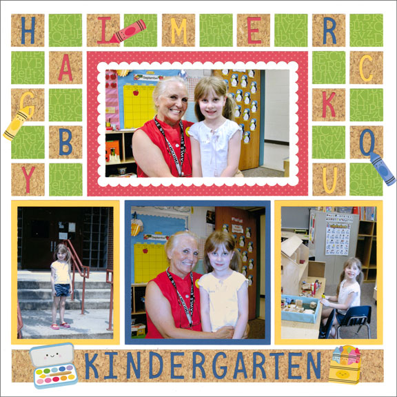
Sometimes a title is all a page needs -- especially if it is in an album all about that person (or a particular vacation). There is no need to record the child's name on every page in the album, but we do want to keep track of the event. Here, simply cutting out the word Kindergarten from Alphabet Dies is enough.
SnapFixTip: Incorporate letters as art, like Paije did on the layout above. She used stickers from Doodlebug Design™ to turn some extra letters into embellishments on her page. You could do something similar
with stickers of ornaments, flowers, stars or other designs.
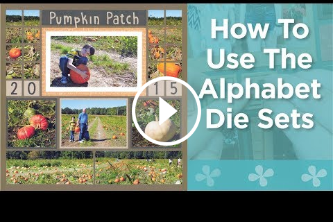
Do you love to add titles and dates to your scrapbook pages? Check out the alphabet & number dies sets! Paije gives you her tips and ideas on how to use these versatile dies. CLICK THE VIDEO above.
10 Ways to Journal
When you need a better explanation on your layout, Mosaic Moments can help. Check out this article for 10 ideas on ways to incorporate journaling into your layout. Just click the blue box below.
Bonus! Here are five more ideas on ways to include journaling on your page pattern, but each idea has two examples using that technique, so you are really getting 10 more ideas. A bonus within a bonus! Click the link below and check it out.
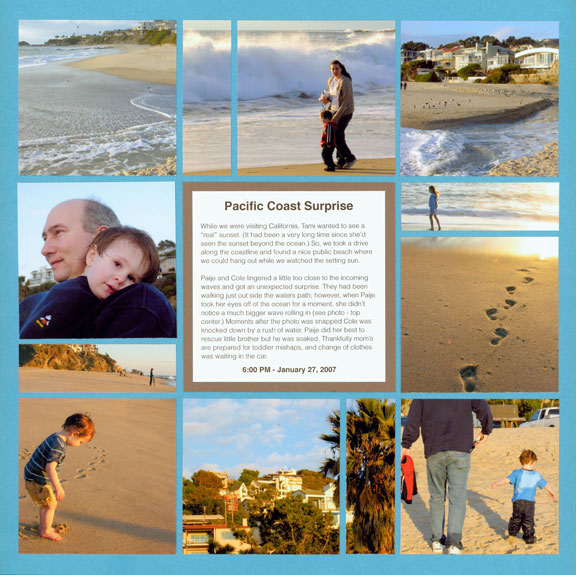
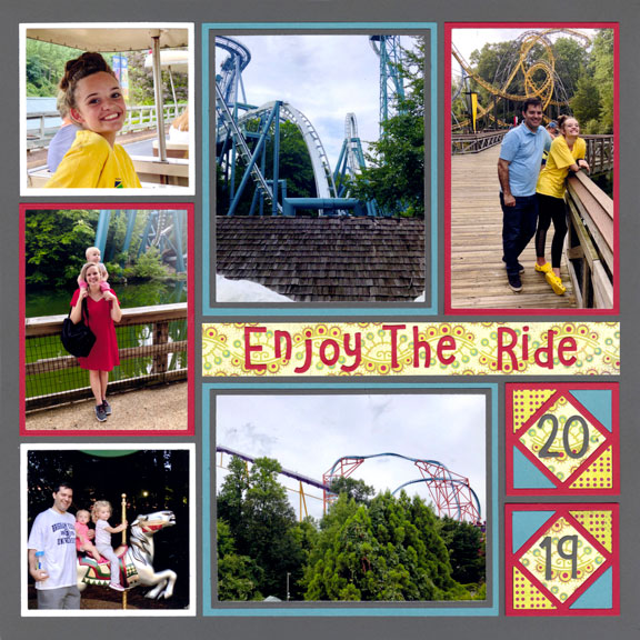
When you only need to include the place and date, you can incorporate them into the design. Here, Jodi used a graphic shape as a decorative piece and then put the numbers right on top.
SnapFix Tip: When using a bold color, like red, as one of your photo mat colors, try to put the red in the shape of an imaginary triangle around the page. Look at Jodi's page above ... if you were to draw a line between the blocks holding the date and the two photos she matted in red, you would have a
triangle. This is an old graphic-design trick ... it keeps the page balanced and makes the eye go around the layout.
Did your photos ever turn out less than perfect? Andrea shows you how to deal with difficult photos, and how to frame the journaling that helps tell the story, here. Click the link below for the details.