SnapFix: the official newsletter of Mosaic Moments®
MOSAIC MOMENTS® PRESENTS:
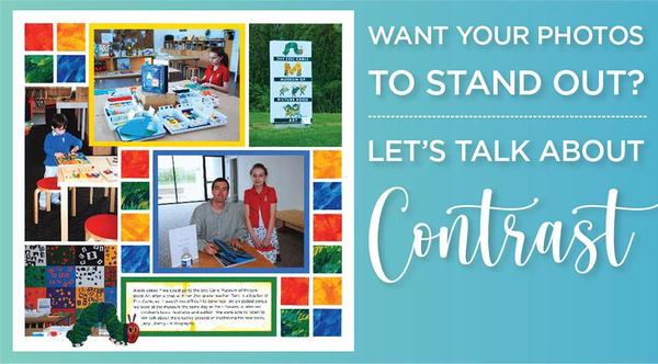
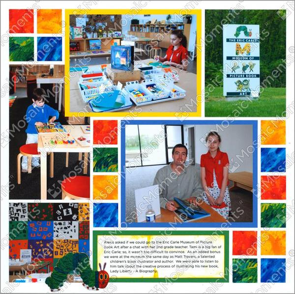
"Eric Carle Museum" by Tami Potter
Hello
Ever put a photo on your page and feel like it just blends in? 😕
You’re not imagining things—sometimes, photos can get lost in a
layout if there’s not enough contrast to make them stand out. But don’t worry—there's an easy fix!
By using color contrast, you can instantly draw attention to your favorite photos and make your layouts look more polished and eye-catching. It’s all about choosing the right
backgrounds, mats, and accents to help your photos pop!
Today, we’ll show you:
Why contrast is important
How contrast
works
Resources to help you create stunning pages every time!
You can bring your photos to life with a bit of contrast!
Think of contrast like a spotlight for your photos—it helps the most important parts of your layout stand out instead of fading into the background.
When you use darker colors behind light photos (or vice versa), it creates visual interest and draws the eye exactly where you want it. It’s one of the easiest ways to take your scrapbook pages from “okay” to “oh wow!” And the best part? Once you get the hang of it, using contrast becomes second nature.
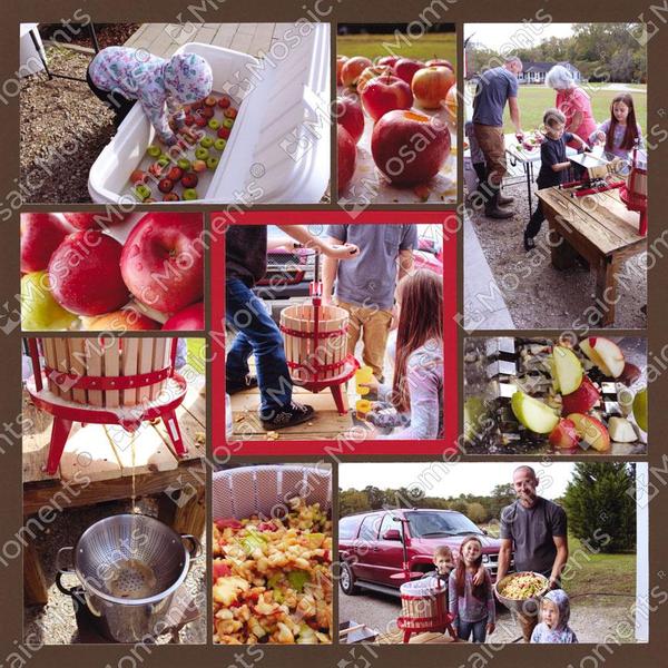
This page uses natural vs. vibrant color contrast, light and dark contrast, textural contrast, and scale contrast to create a rich, warm, storytelling experience.
Points about the color contrast:
The dominant color tones in the photos are natural—lots of earthy reds, greens,
and browns.
However, the red accents (especially from the apple press and the apples themselves) create a bold, eye-catching contrast within almost every photo.
The use of a red mat draws attention to the important cider pressing action shot.
Against
the dark brown background, all the photos feel warmer and richer, almost like autumn itself — the brown sets a cozy, rustic stage that contrasts nicely with the shiny apples and bright machinery.
Paying attention to the role of
contrast helped this page feel down-to-earth and full of life, without feeling too chaotic — the thoughtful use of the red mat and brown background really ties it all together beautifully.
In design, contrast is defined as the juxtaposition of elements in order to highlight their…
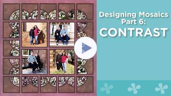
Watch this YouTube Video for More About Contrast in Scrapbook Design:
Paije walks you through the design element of contrast. She'll show you examples of what to do and what not to do with actual layouts. You will never again be stuck with layouts that have photos that don't pop off the pages!
Contrast: Secret to Eye-Catching Pages
"Eric Carle Museum" by Tami Potter
Ever notice how some
scrapbook pages just jump off the page while others feel a little… flat? The secret is contrast!
Contrast is what helps your photos stand out instead of blending into the background. It creates visual interest, draws the eye to important details, and makes your whole layout
look polished and professional—without any extra effort!
Here’s how contrast works in your scrapbook layouts:
Light vs. Dark – Placing a dark photo on a light background (or vice versa) makes it pop!
Bold vs. Soft Colors – Pairing strong colors with neutrals helps create balance instead of overwhelming the page.
Scale - Using a variety of close-up shots versus distant shots.
Textured vs. Smooth – Mixing patterns, solids, and textures adds depth and keeps the page from looking too flat.
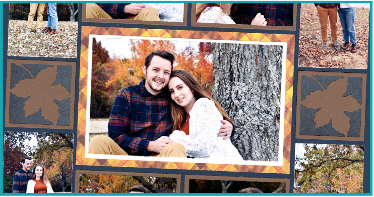
Matting for Emphasis – Adding a contrasting mat around a photo makes it the focal point of your layout!
Next time you’re designing a page, try swapping your background or mat color to see how it changes the look of your photos. You might be surprised at how much a little contrast can transform your layout!
Never miss an important Mosaic Moments alert again!
On your phone, text just the word JOIN to the number 833-264-2066, and you'll be signed up to get a text message at the beginning of each snapncrop.com sale. You can stop receiving messages anytime by texting STOP. Message and data rates may apply.